(01 - 05)
(06 - 07)
(08 - 10)
(11 - 13)
(14 - 16)
(17)
01
Social Cause Posters

For this project, I researched and created a visual campaign to promote sexual health, especially in young people who live in Utah. Utah, where I am from, has a very conservative approach to teaching sexual health in its schools. I wanted to create a series of posters to encourage young people to be aware of the risks involved, while also encouraging teenagers and young adults to be tested for sexually-transmitted diseases, namely HIV. The campaign, centered around the phrase, How well do you know your partner?, is both nostalgic and contemporary at the same time.

02
Quilting: Design & Womanhood Campaign

This poster began as an experiment in form and was later assigned meaning by my classmates. The forms, which are somewhat space and technology-like, became a reference to a movie I love, 2001: A Space Odyssey.
03
Type Fusion Poster
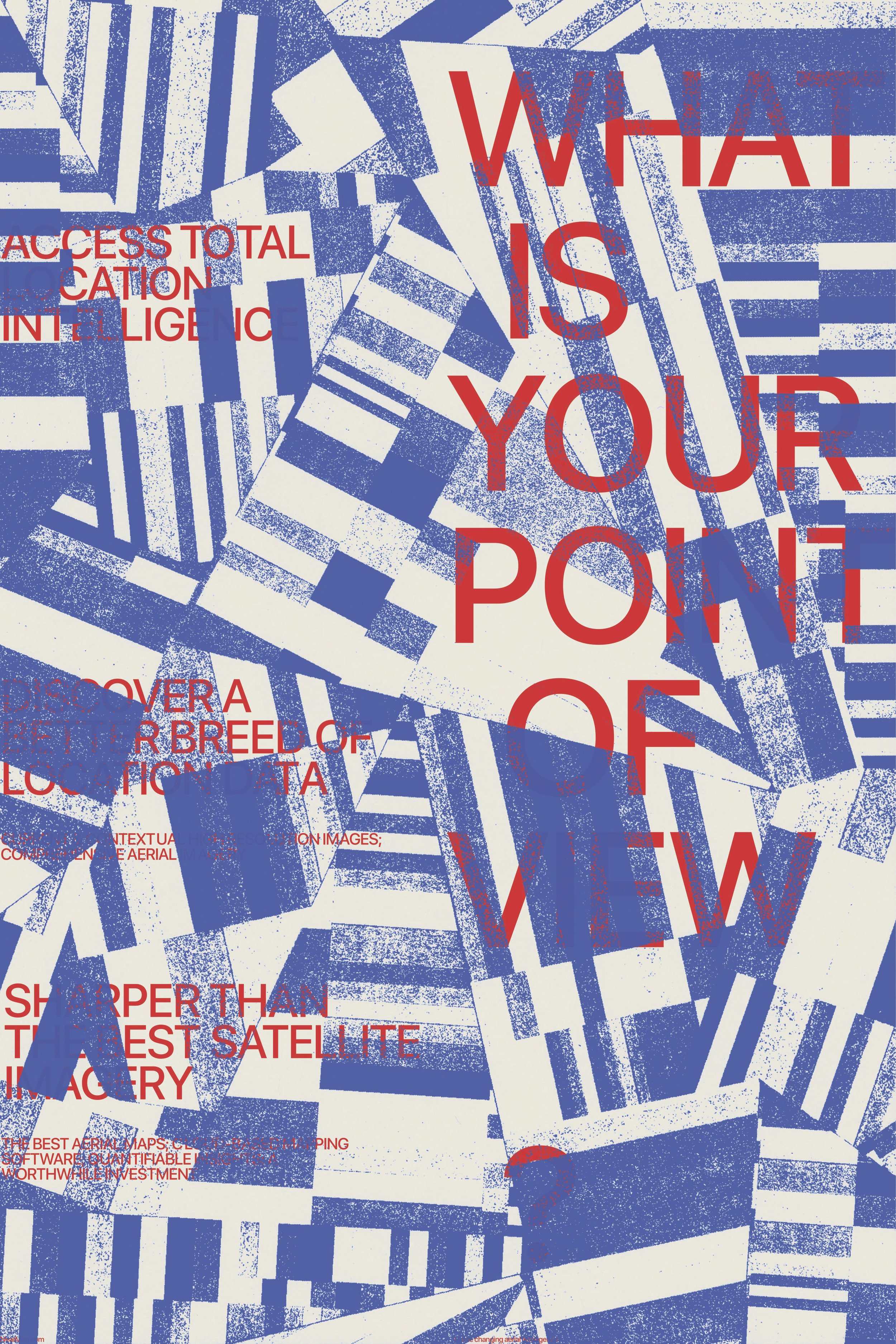
This project was initially inspired by my quilting research project, specifically a style of quilting called improvisational quilting. The original image I created for this poster was done analog: I printed many patterns of stripes, cut them all up, rearranged them, and scanned them back into the computer. The meaning for the poster was then assigned to it by a classmate, based on their own initial interpretation of it.
04
Movie Poster

I was commissioned to make this poster for Old Friend Photo Booth in New York City, New York. They wanted something illustrative but simple and clean. I created a custom typeface, as seen in the display type, that references vintage hand-painted signs of New York. The secondary type is written in oil pastel.
The poster is seen in the New York Times feature about Old Friend Photo Booth. You can see the article here.

This poster began as an experiment in form and was later assigned meaning by my classmates. The forms, which are somewhat space and technology-like, became a reference to a movie I love, 2001: A Space Odyssey.
05
Photo Booth Poster
As seen in the New York Times


06
Dozen Magazine

Dozen Magazine is a baking magazine and companion. The editorial project includes custom photography, a cover page, a table of contents, a feature spread, and two custom spot articles.

07
Type as Image Spread
Using Marshall McLuhans essay Medium is the Message as my inspiration for this project, I created a “type as image” style editorial spread to display the article. I wanted to focus on the ideas of medium in terms of graphic design. Much of the discourse surrounding his ideas are technical, so I wanted to give a feeling of something mechanical, while also opening up the question, how is design made? And does it change the meaning of what is created?


08
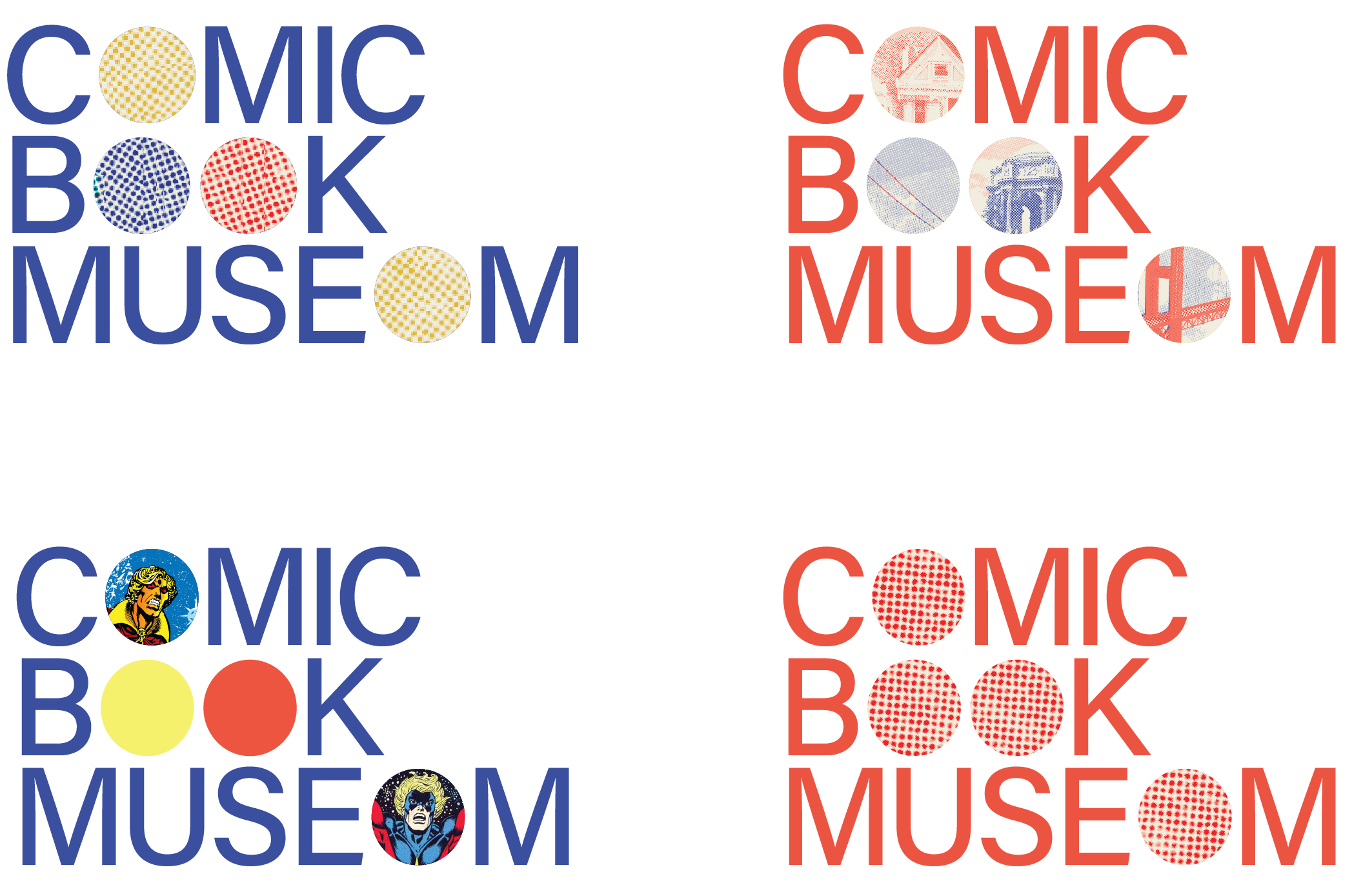
Comic Book Museum

The Cartoon Art Museum, located in San Francisco, is a hub throughout the United States and the world of comic art. People come together here to celebrate comic art and the influence it has had on our society. It is a small museum in the city, however, and often goes unnoticed amid the hustle and bustle of the wharf. I propose that the Cartoon Art Museum undergoes a rebranding, including a rename to the Comic Book Museum of San Francisco. This name is a better way to represent the contents of the museum to new visitors and guests.
For this rebranding project, I chose to focus on select comic book motifs and incorporate them into the brand in a way that feels more contemporary. The logo identity itself was created initially to reference the familiar half-tone pattern that is so prevalent in comic arts. The ‘O’s are replaced with simple circles, which make this reference, but also symbolize an empty framework. The brand identity works revolve around this empty frame, which can remain flat colors or be replaced with imagery or patterns. These circles are much like the museum itself: a humble framework that lets the art inside take the spotlight.


09
Zing! Coffee

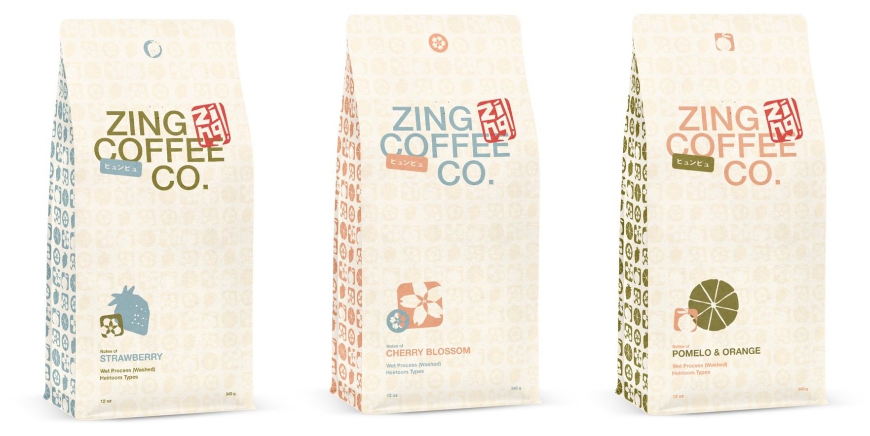
Zing! is an independent green coffee roaster located in Kyoto, Japan. Zing! is unique in the indie coffee roasting business in that they aim to bring Japan’s beloved and classic green coffee to a young, contemporary market in and beyond Japan. Zing! wants to be perceived by its audiences as contemporary, classic, and energizing.
10
Triton Fresh Seafood

Introducing Triton, the wild-caught Mediterranean seafood brand that offers fresh seafood like no other. Triton offers all Mediterranean “fruits of the sea” including shrimp, octopi, sardines, mullets, breams, sea bass, conger eels, sharks, and dogfishes, etc. Triton is the perfect choice for the health- conscious foodie.
Our seafood is unique because it is always sold fresh and never frozen. As Triton controls the waters, we control the quality of our seafood from ocean to plate. Triton represents the perfect blend of taste and nutrition. Triton wants to be perceived as fresh, flavorful, zesty/vibrant, natural, healthy, sustainable, premium, and artisanal.


11
Grace Lund Film Site
gracelundfilm.com

12
Folio App

13
Montana Willden Photo Site
tanawillden.com

I designed and created this website for Montana Willden Photography as both a portfolio site and a way to communicate with clients. She wanted to introduce herself, feature her work, explain her process, answer questions, and communicate what makes her unique as a wedding photographer in a photo-saturated community. While thinking about popular websites and brands in her community, I wanted to create something that could stand out in the field, while also being simple enough to show off her beautiful work.
You can now visit an updated working version of the site here.
I designed and created this website for Grace Lund Film. I also created custom branding for her, including primary, secondary, and tertiary logos, a color palette, and a type system. You can see all three working in these images from the site.
You can now visit an updated working version of the site here.
Folio is a digital bookshelf. Similar to Goodreads, Folio allows readers to document and share their reading habits and updates with their friends.
In creating this app, my goal was to create a user interface that was easy to explore and simple enough to let the book covers being featured lead the navigation.
14
Travel Series

I designed these book covers as a complete set of three. Inspired by the cut out and collage designs of artists like Paul Rand and Corita Kent, I created these covers by cutting shapes and letters out of paper and then transferring into the computer. This analog process allowed for a more organic and adventurous feel to these beloved travel books.
This book cover is a type-as-image approach to portraying one of the most well-known painters. Instead of using his artwork, I broke up the type in a way that I feel references Picasso without speaking for him.
UFO of God is a unique book that recounts a man’s experiences with spirituality and space. I went with an abstract approach to an illustration and minimal type. The various circles and squares reference crop circles, which connect to the author’s idea of connecting to an other-worldly presence and seeing God, represented in the cross, within it.

Picasso
15
16
UFO of God

17
Cultural Broadside

This illustration was created in the cubist style and is meant to abstractly represent the country of Japan. Circles represent the rising sun, and lanterns, chopsticks, a ramen bowl, and the iconic shrine gates are also represented. Japan has a very rich and beautiful culture; this illustration could be used for tourism promotional materials, including brochures, billboards, or other kinds of murals.